Accordions
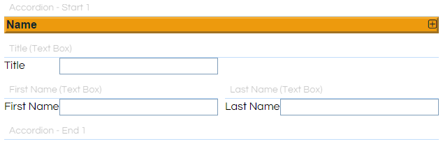
The Accordion controls (Accordion - Start, and Accordion - End) are paired controls that need to be placed around a group of Fields on a Workflow Page. Any Fields contained between them can be shown or hidden by the agent by clicking the visible Accordion bar.
This feature is particularly useful for busy Workflow pages, to hide sets of controls until they are needed. In this example the Name and Address sections are shown, with the Details section remaining hidden:

The Accordion - Start control is visible to agents as a simple, stylable bar. The Accordion - End control is not visible to agents.
These controls are part of the Intermediate control pack, and will only be available if you have the appropriate licence part.
How To
Place any Fields to be contained within the Accordion on the Page, and then place an Accordion - Start immediately above and an Accordion - End immediately below the group:

The Accordion's options are configured via the Accordion - Start control. The options and style can be configured in the Options and Styling tabs of the Field Properties, and Validation can be applied if desired.
The Accordion - Start control has two unique options available in its Options tab:
|
Option
|
Description
|
|
Display Image
|
This controls whether the icon at the right-hand side of the Accordion bar is displayed or not.
|
|
Start Open
|
This controls whether the Accordion group is shown or hidden initially.
|
Notes
You can tell whether an accordion is open or closed in code by checking its value. It has a value of "true" or "false" representing whether it's expanded or not, and you can also set its value to expand or collapse it via JavaScript.
|
if ([Accordion - Start] == "true") {
//The Accordion is expanded, we can do things with it and its content
}
else if ([Accordion - Start] == "false") {
//The Accordion is folded, lets force it to expand again
[Accordion - Start] = "true";
}
|
The Accordion - Start can also be toggled by JavaScript or Update Links. Please see the .click() article for more information and an example regarding using JavaScript.